Market Basket Analysis (3rd step of Customer Analytics)
Customer Relation Management classroom project
If you are interested in articles related to my experience, please feel free to contact me: linkedin.com/in/nattapong-thanngam
This article is part of a series about Customer Analytics_._ (Part 1: Customer Profiling with Descriptive Analytics with SQL),(Part 2: Customer Segmentation with Clustering), (Part 3: Market Basket Analysis), and (Part 4: Product Recommendation)
Market Basket Analysis is a technique that identifies the strength of association between pairs of products purchased together and identifies patterns of co-occurrence. A co-occurrence is when two or more things take place together. The popular technic is “Product Association” which has 3 metrics ( Support, Confidence, and Lift).
Assume itemset = {water, soda}
- Support: This measure gives an idea of how frequent an itemset is in all the transactions (Transactions containing water and soda: Total number of transactions).
- Confidence: This measure defines the likeliness of occurrence of consequent on the cart given that the cart already has the antecedents (Transactions containing water and soda: Transactions containing only water).
- Lift: Lift controls for the support (frequency) of consequent while calculating the conditional probability of occurrence of {Y} given {X}. Normally lift will be set greater than 1.
Note:
- Data set from Dunnhumby_Carbo-Loading
- Use Python in colab (new tools again ^__^)
- After joining, I want to focus only last 6 months' information.

(1) 180 days data (Image by Author)
- After pivot, we have to fulfill NaN value as 0 and replace number as 1. It means “Purchase” or “Not purchase”
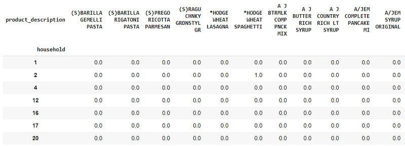
(2) Pivot 180-day data and convert value to 0/1 (Image by Author)
- Create visualization to find most/least popular product
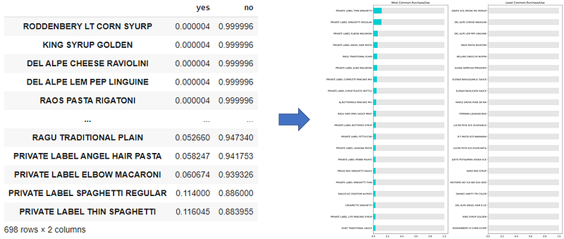
(3) Top 20 most/least popular products (Image by Author)
- For Market Basket Analysis, I use Apriori algorithm in python and visualization the result by Community Detection technic
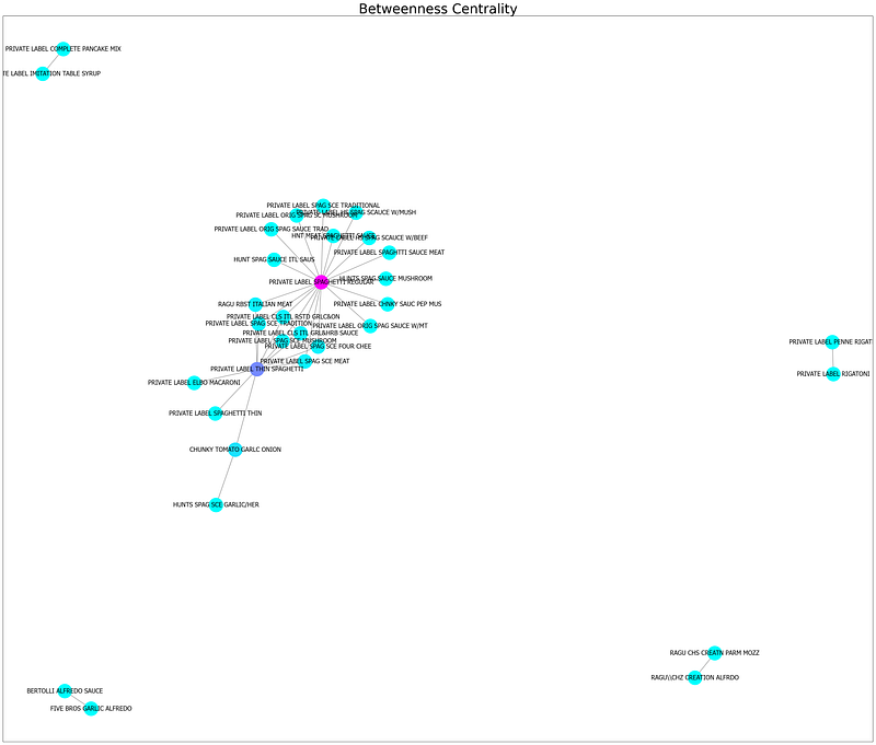
(4) Community Detection “Closeness Centrality Technic” (Image by Author)
- If the text cannot be read, Plotly library can support visualization.
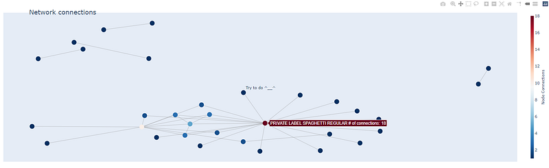
(5) Dashboard by Plotly (Image by Author)
- After zoom in, we will find the linkage item between 2 groups that are PRIVATE LABEL SPAGHETTI REGULAR, PRIVATE LABEL SPAGHETTI REGULAR
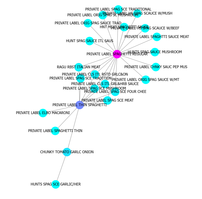
(6) Zoom-in picture 4 (Image by Author)
- The network graph of association rules can help us see overview relation too.
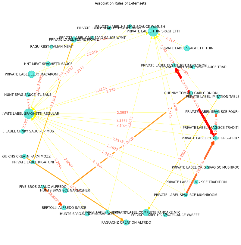
(7) Network graph of association rules (Image by Author)
- We can create other dashboards from Collaborative Filtering analysis.It is a technique that can filter out items that a user might like on the basis of reactions by similar users.
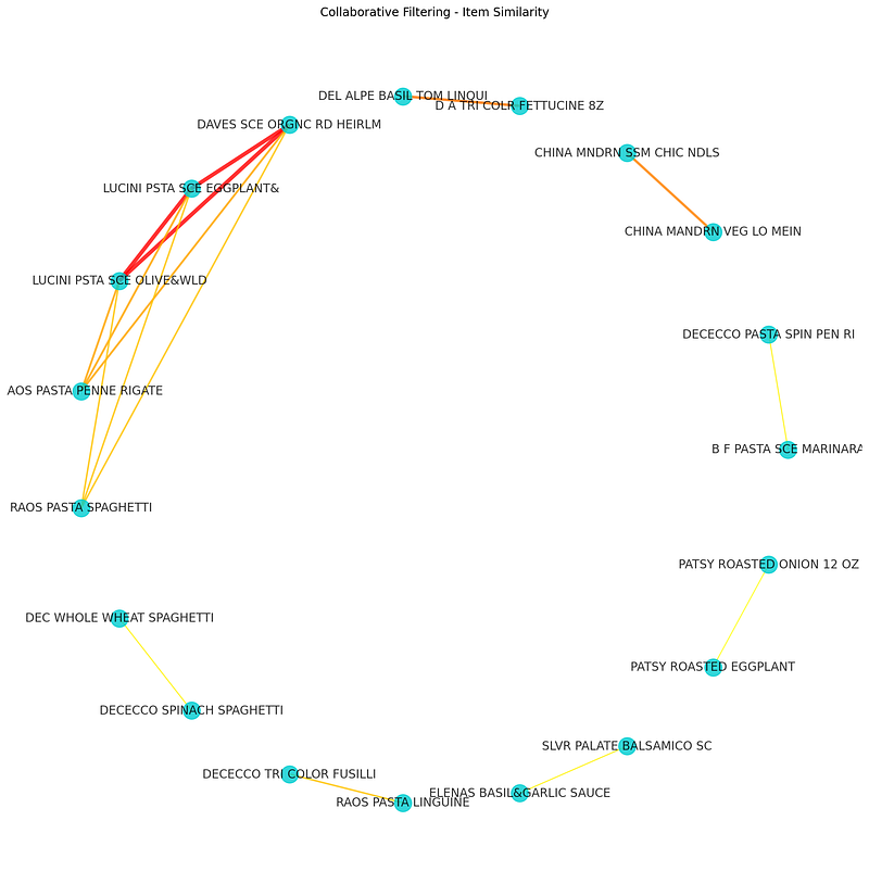
(8) Collaborative Filtering dashboard-1 (Image by Author)
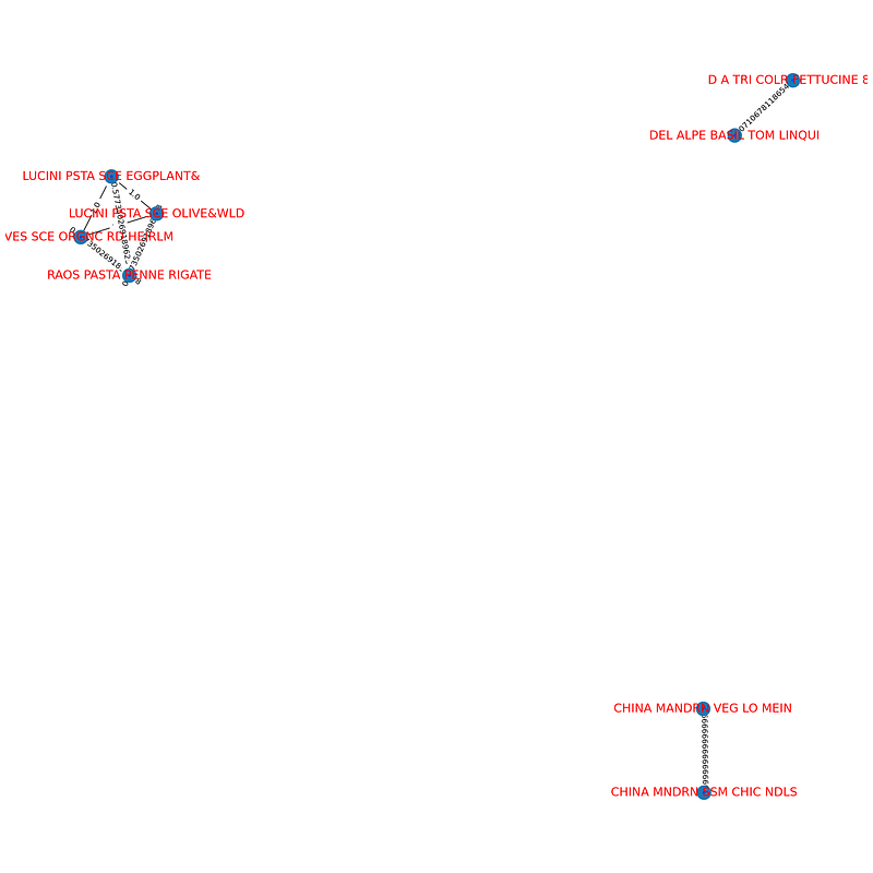
(9) Collaborative Filtering dashboard-2 (Image by Author)
- The different views of Picture 8 and picture 9 come from settings. However, they are the same results that have 3 strong relationships.
- Back to basis. Top 10 best seller products also useful
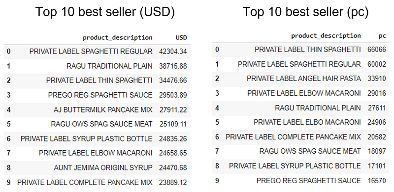
(10) Top 10 best seller (Image by Author)
- Actually, if we have real data, it will be easier to understand the relationship between the product’s group.
- After Customer profiling, Customer segmentation, and Market Basket Analysis, we can use all information to create proper campaign for the customer.
Next Step
- After customer segmentation with clustering, we will do Product Recommendation with Similarity Matching (Part 4)
Please feel free to contact me, I am willing to share and exchange on topics related to Data Science and Supply Chain.
Facebook: facebook.com/nattapong.thanngam
Linkedin: linkedin.com/in/nattapong-thanngam
Originally published on Medium
Related

A Practical Guide to Building Agents
คู่มือปฏิบัติ: การสร้าง Agent ด้วย LLM โดย OpenAI

AI in the Enterprise โดย OpenAI
ถอดรหัสเคล็ดลับองค์กรระดับโลก ปลดล็อกศักยภาพ AI สร้างความได้เปรียบทางธุรกิจ
Best Practices for Bar Charts
Visualization Series — Episode 2

Best Practices for Line Charts
Visualization Series — Episode 3